
By Home Tweakz Team | Home Improvement & Interior Design Experts | Updated 2026
Introduction
Paint is the single most affordable way to completely transform a room. A can of paint and a weekend can take a tired, forgettable living room and turn it into the space you actually want to come home to.
But walking into a paint store — or scrolling through hundreds of color swatches online — can feel paralyzing. Warm or cool? Bold or neutral? One wall or all four? The options are endless, and the stakes feel high because paint touches everything.
This guide cuts through the noise. Whether you’re drawn to soft, calming neutrals or you’ve been eyeing something dramatic and unexpected, these ten living room color ideas will give you a clear starting point — along with practical advice on how to make each one work in your actual home.
Why Choosing the Right Color Matters More Than You Think
Color doesn’t just affect how a room looks. It affects how it feels.
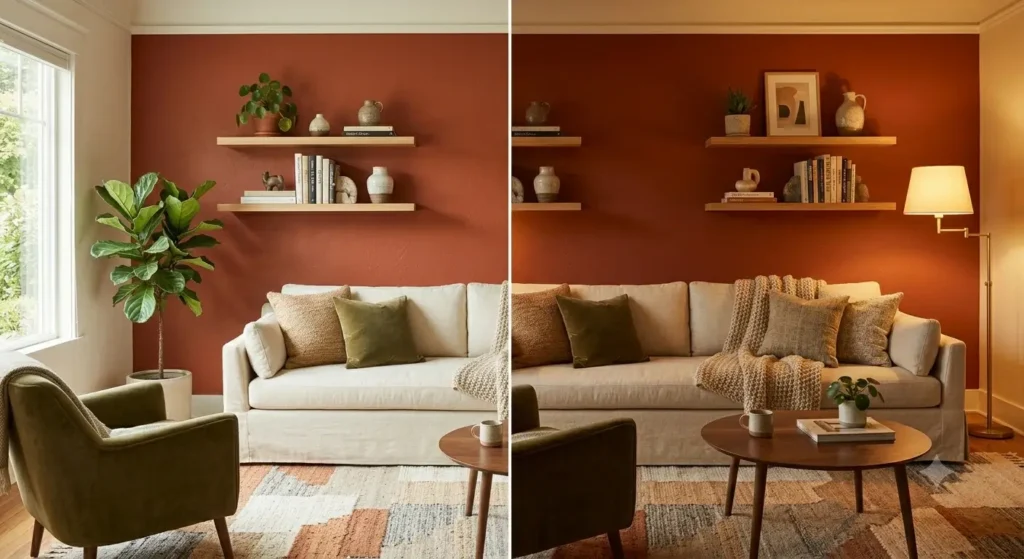
Research from the National Institute of Standards and Technology (NIST) confirms that color perception in interior spaces is directly tied to lighting conditions, surface finishes, and surrounding hues — which is why a color that looks perfect on a swatch can read completely differently once it’s on your walls.
Beyond science, color sets the emotional tone of a room. A deep navy blue creates intimacy and focus. A warm beige invites relaxation. A rich terracotta brings energy and earthiness. Getting the color right means the room works for the way you actually use it — not just the way it looks in photos.
The good news is that with a clear plan, choosing the right paint color for your living room is far more approachable than it seems. Start with our living room design guide if you’re working on the full picture before narrowing down to color.
Overview of Living Room Color Options
Before diving into specific shades, it helps to understand the three major color families you’ll be choosing from:
Most successful living rooms lean on one family as the dominant color and pull accents from another. Use these families to build cohesive living room color schemes that support your furniture and lighting.
| Color Family | FamilyMoodBest | For |
|---|---|---|
| Soft Neutrals | Calm, timeless, versatile | Any style, any size room |
| Bold Hues | Dramatic, personality-driven | Accent walls, confident spaces |
| Warm/Earthy Tones | Cozy, grounded, organic | Traditional, boho, rustic styles |
| Cool Tones | Fresh, airy, modern | Contemporary spaces, good natural light |
Best Living Room Colors: Soft Neutrals
Neutral living room colors are perennially popular for good reason — they work with almost any furniture, any lighting, and any design direction. But “neutral” doesn’t have to mean boring.
- Beige and Cream
Beige is having a serious moment in interior design right now, and it deserves every bit of the attention. Unlike the cold gray that dominated living rooms for the past decade, beige and cream tones read as warm, inviting, and genuinely livable.
The key is to choose a beige with the right undertone for your space. Rooms with warm, south-facing light look stunning in creamy whites and golden beiges. Rooms with cooler, north-facing light benefit from a beige that leans slightly pink or peach — it counteracts the blue tones without going obviously warm.
Pair beige walls with natural wood tones, linen upholstery, and soft brass hardware for a look that feels both current and timeless. Avoid matching beige walls with beige furniture — the lack of contrast makes the room feel flat.
For a beige-forward living room that still has design depth, our warm minimalism living room ideas shows exactly how to layer this palette without losing visual interest. 2. Light Gray
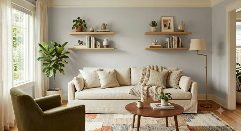
Light gray became the default living room color for most of the 2010s, and while it’s no longer the cutting-edge choice it once was, it remains genuinely practical. Gray is one of the most flexible of all the best living room colors because it pairs equally well with cool metallics, warm woods, and bold accent colors.
If you’re going gray, go intentional. Choose a gray with a clear undertone — blue-gray for a cooler, more contemporary feel; greige (gray-beige) for something warmer and more transitional. True neutral grays with no undertone can feel cold and institutional under certain lighting.
Light gray works particularly well in open-plan living areas where consistency across a large footprint matters more than drama.
Bold Hues: Color Suggestions for Living Room with Impact
If neutral feels too safe, bold hues deliver the kind of color suggestions for a living room that genuinely transform the space. 3. Navy Blue
Navy blue is one of the most sophisticated color choices you can make for a living room — and one of the most misunderstood. People assume dark colors make rooms feel small. In reality, a well-executed deep navy can make a room feel intentional, cozy, and enveloping in the best possible way. A navy blue living room can feel intentionally cozy rather than cramped when balanced with light trim and warm textures.
Navy works best in rooms with decent natural light and white or cream trim. The contrast between the deep wall color and crisp trim keeps the room from feeling heavy. Pair navy walls with warm brass fixtures, natural wood coffee tables, and cream or camel-colored upholstery to balance the cool intensity of the blue.
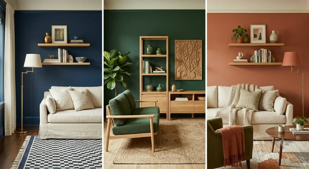
An accent wall in navy is also a smart option if you’re not ready to commit to four walls. The wall behind a sofa or TV unit is the natural choice — it creates visual depth without darkening the whole room. 4. Rich Green
Green has emerged as one of the most versatile and popular living room colors of recent years, and for good reason. It connects interior spaces to the natural world, reads as sophisticated and calm simultaneously, and works across design styles — from traditional to modern.
Deep forest green or hunter green on an accent wall creates an almost library-like atmosphere — intellectual, warm, and grounded. Sage green on all four walls is softer, more contemporary, and works beautifully with warm neutrals and natural textures.
If you’re incorporating houseplants into your living room (which pairs naturally with any green palette), our guide on best air purifying plants for home has solid recommendations for plants that also improve indoor air quality. 5. Terracotta
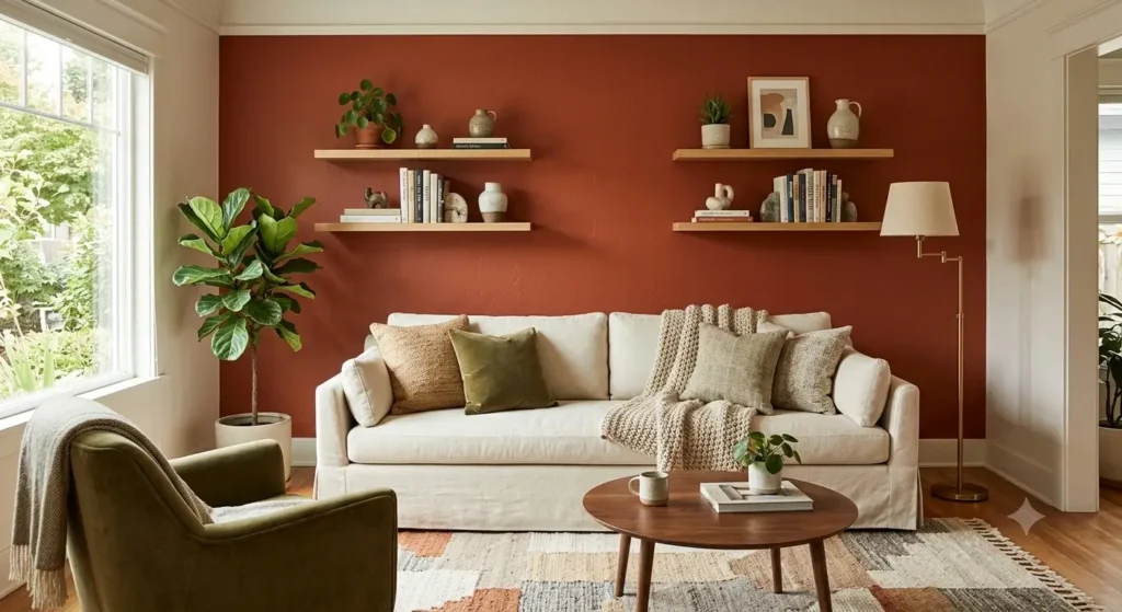
Terracotta is one of the most warmth-inducing of all living room paint colors, and it pairs effortlessly with the earthy, organic interior trends that continue to dominate in 2026. It’s essentially a warm, reddish-orange clay tone — think of the color of Italian tile or sun-baked earth.
It works beautifully in rooms with warm-toned wood floors and furniture, woven textiles, and natural materials. Terracotta also photographs exceptionally well, which makes it popular for anyone who cares about how their home looks on social media or in listing photos. A terracotta living room reads warm, grounded, and welcoming — especially alongside natural textures.
Balance terracotta walls with cream or off-white upholstery, brass accents, and woven rugs. Avoid pairing it with cool grays or stark whites — the contrast is jarring rather than dynamic.
Color Suggestions for Living Room Based on Style
The right color isn’t just about what looks good in isolation — it’s about what works with your specific design direction.
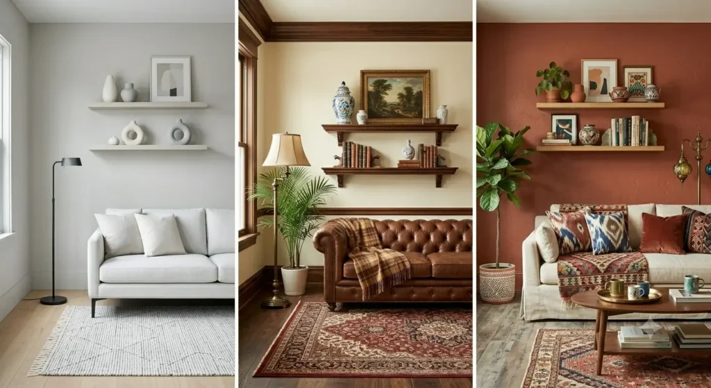
Modern living rooms lean toward restraint. The best paint colors for a modern living room are those that don’t compete with the furniture or architectural details — they let the lines, materials, and proportions do the work.
Light gray, warm white, and muted sage green are all strong choices. Avoid anything too saturated or warm if your furniture palette is cool and contemporary — the mismatch reads as unresolved.
One technique that works particularly well in modern spaces: paint the ceiling the same color as the walls. It removes the visual boundary between walls and ceiling, making the room feel taller and more seamless. This works especially well with soft, muted shades.
For a complete approach to designing your space, see our Living Room Design Guide.
Traditional living rooms benefit from color that conveys warmth, history, and a sense of permanence. Think warm creams, soft butter yellows, muted sage greens, and deep burgundies or navies for accent walls.
The key in a traditional space is to let the color sit harmoniously with the wood tones in the room — most traditional furniture leans warm, so the wall color needs to complement rather than fight that warmth.
Painted trim in crisp white or off-white is almost always the right call in a traditional living room — it defines the architectural details that give the style its character. 8. Eclectic Arrangements — Bold and Personal
Eclectic living rooms give you the most freedom with color because the design approach is deliberately maximalist and personal. The only real rule in an eclectic space is intentionality — even bold choices should feel considered rather than chaotic.
Terracotta, deep teal, mustard yellow, and even moody plum can all work in eclectic spaces. The wall color functions as a backdrop for a layered mix of furniture, textiles, and objects — so choose something that unifies rather than competes.
Painting Options for a Living Room
Choosing the color is only part of the decision. How you apply paint — and where — matters just as much.
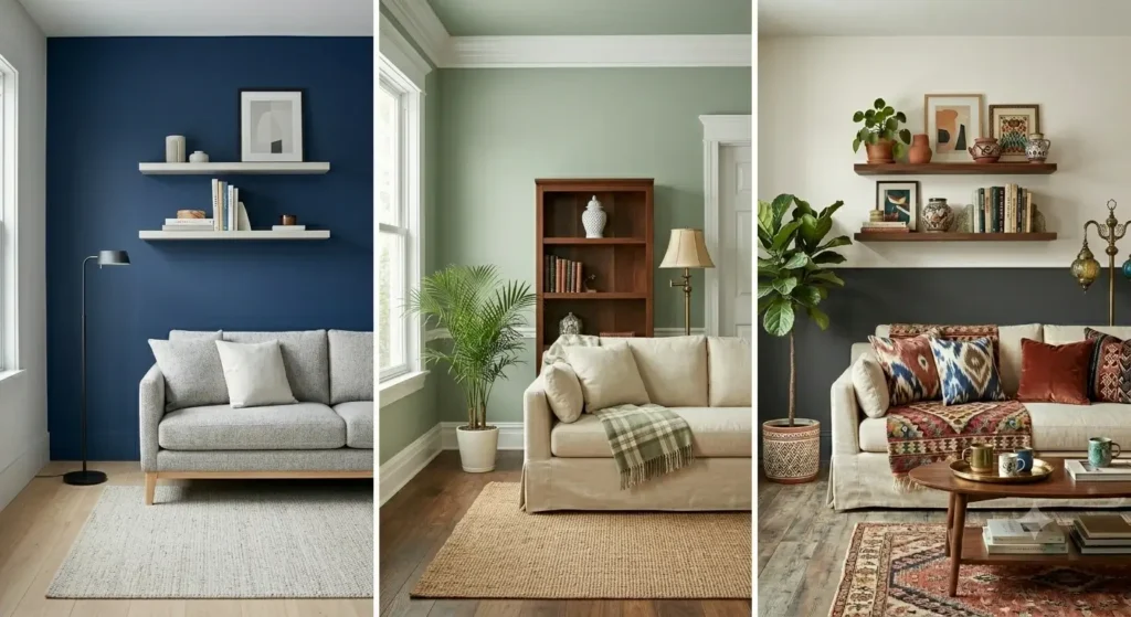
Among living room accent wall ideas, a single bold feature wall is the most popular option — and for good reason. It lets you introduce a bold color without overwhelming the room, and it creates a natural focal point that anchors the seating area.
The most effective accent wall in a living room is typically the wall behind the main sofa, the wall where the TV sits, or the wall with the fireplace. These are the walls that draw the eye naturally — making them bold amplifies that effect rather than creating an awkward visual collision.
For accent walls, you can go significantly darker or more saturated than you’d use on all four walls. A shade that would feel oppressive on all four walls can feel rich and dramatic on one. 10. Two-Tone Techniques — Sophisticated and Architectural
Two-tone living room paint is one of the most underused techniques in residential living rooms, and it delivers a surprisingly architectural result. The most common approach: paint the lower third of the wall in a deeper tone and the upper two-thirds in a lighter complementary shade, with a chair rail or painted line as the divider.
This works particularly well in rooms with standard ceiling heights (8–9 feet) because it visually raises the perceived ceiling. A deeper charcoal or navy on the bottom, warm white on top, with crisp white trim throughout — this is a classic combination that looks far more expensive than it is.
If you’re considering painting techniques beyond flat color, our DIY accent wall ideas for bedrooms covers textured and pattern-based techniques that translate well to living rooms too.
Lounge Room Paint Colours to Consider
Warm Tones
Warm lounge room paint colours — amber, terracotta, warm cream, honey gold — make a room feel inviting and lived-in from the moment you walk in. These are the colors that make you want to settle in, light a candle, and stay.
They work best in rooms that don’t get a lot of direct sunlight, as the warmth of the color compensates for the lack of natural light. In very sunny rooms, warm tones can tip into feeling hot rather than cozy — balance with cool accents and plenty of white trim.
A well-chosen warm color palette pairs beautifully with modern area rugs in natural fibers — jute, wool, or sisal — which reinforce the organic, grounded feel of the palette. Cool Tones
Cool tones — soft blues, blue-grays, pale lavenders, cool sage — bring a sense of calm and freshness to a living room. They’re particularly effective in rooms with good natural light, where they read as airy and serene rather than cold.
Cool-toned sitting room wall colours also make a room feel slightly more spacious, which is worth considering if you’re working with a compact layout. Pair cool walls with warm textiles — a cream sofa, amber throw pillows, a warm-toned rug — to avoid the room feeling clinical.
For decorating ideas that work alongside cool-toned walls, our renter-friendly wall decor ideas has options that work without permanent changes to the space. Earthy Shades
Earthy colors — warm browns, clay, moss green, dusty rose — are having a sustained moment in interior design and show no signs of fading. They connect indoor spaces to the natural world, feel grounded and calming, and age extremely well without ever looking dated.
Earthy shades pair well with natural materials: raw wood, linen, rattan, stone. They also work beautifully with large-format wall art and botanical prints. For wall treatment ideas that complement earthy palettes, our large wall decor ideas guide has options that scale properly to living room walls.
Key Takeaways
- Color affects both the look and the emotional feel of a room — choose based on how you want the space to function, not just how it looks on a swatch.
- Soft neutrals (beige, cream, light gray) are the most versatile choices and work across every design style and room size.
- Bold hues like navy blue, rich green, and terracotta make a powerful statement when used intentionally — especially on accent walls.
- Match your color choice to your design style: cool restraint for modern spaces, warm depth for traditional rooms, maximum freedom for eclectic arrangements.
- Two-tone painting and accent wall techniques give you architectural interest without requiring a full room repaint.
- Always test paint in your actual room under your actual lighting before committing to a full application.
- Paint finish matters: matte for a sophisticated, low-sheen look; eggshell or satin for durability in high-traffic areas.
Conclusion
The right living room color can change everything — how the room feels at 7am with morning light coming through, how it looks at 9pm with lamps on, and how much you enjoy spending time in it day to day.
Start by deciding on the mood you want to create. From there, choose a color family — warm, cool, or neutral — and narrow down to specific shades based on your furniture, your light, and your style. Test before you commit, and don’t be afraid to go a little bolder than feels safe. The rooms people love most are usually the ones with a little personality.
If you’re redesigning your living room more broadly, our guides on small space interior design tips and modern home decor ideas for every home are worth reading alongside this one.
Frequently Asked Questions About Living Room Color Ideas
Question: How should I test paint colors in my living room before committing?
Short answer: Test colors in your actual room under your actual lighting. Paint generous swatches on more than one wall and look at them throughout the day and evening to see how natural light and lamps shift the color. Judge the swatches next to your trim, floors, and key fabrics, since surrounding hues and finishes influence how a color reads.
Question: Which paint finish works best for living rooms?
Short answer: Use matte for a sophisticated, low-sheen look, and switch to eggshell or satin where you need durability in high-traffic zones. For trim, crisp white or off-white in a higher-sheen trim paint helps define architecture—especially in traditional spaces—and provides clean contrast against wall colors.
Question: Do dark colors like navy actually make a living room feel smaller?
Short answer: Not necessarily. A deep navy can feel intentional, cozy, and enveloping when balanced with decent natural light, white or cream trim, and warm textures. If you’re hesitant to go all in, use navy on a single accent wall (behind the sofa, TV, or fireplace) to add depth without darkening the whole room.
Question: How do I choose the right beige or cream based on my room’s light?
Short answer: Match undertone to orientation. South-facing rooms love creamy whites and golden beiges. North-facing rooms benefit from a beige with a touch of pink or peach to counteract cool, blue light. Whatever you pick, avoid beige-on-beige everything—add contrast with wood tones, layered textiles, and lighter or darker upholstery.
Question: How do I build a cohesive color scheme from the suggested color families?
Short answer: Let one family lead and pull accents from another. For example: soft neutral walls (beige, greige) with navy or forest-green accents; terracotta walls balanced by cream upholstery and brass; cool sage walls in modern spaces with white trim and natural textures. Two-tone treatments (deeper charcoal or navy on the lower third, warm white above) add architectural interest without overwhelming the room.
Question: How do I keep a neutral living room from feeling flat or bland?
Short answer: Build in contrast and texture. Avoid matching beige walls with beige furniture. Instead, pair warm neutrals with natural wood tones, linen upholstery, layered textiles, and soft brass hardware. Choose a neutral with the right undertone for your light (creamy/golden in south-facing rooms; slightly pink/peach-beige in north-facing rooms) so the color reads intentional rather than washed out.
Question: Where should I place the paint break for a two-tone wall—and do I need existing molding?
Short answer: Paint the lower third in a deeper tone and the upper two-thirds in a lighter complementary shade. You don’t need existing molding—use a crisp taped line or add a simple chair rail as the divider. This approach is especially effective with 8–9 ft ceilings because it visually raises the ceiling. Classic combo: deeper charcoal or navy below, warm white above, with crisp white trim.
Question: My living room gets little direct sunlight—what colors work best, and how do I keep it from feeling dull?
Short answer: Lean into warm tones (amber, terracotta, warm cream, honey gold) to compensate for cool, low light and create an inviting feel. In contrast, very sunny rooms can make warm colors feel hot—balance those with cooler accents and plenty of white trim. Whatever your light level, mirrors and good lighting will amplify the color you choose.
Question: When is painting the ceiling the same color as the walls a good idea?
Short answer: In modern, clean-lined spaces where you want a seamless envelope and a taller feel. Using the same soft, muted shade on walls and ceiling removes the visual boundary at the ceiling line, making the room read more cohesive and expansive.
Question: How do I choose a gray that won’t feel cold or institutional?
Short answer: Pick a gray with a clear undertone and test it in your lighting. Blue-gray reads cooler and contemporary; greige (gray-beige) adds warmth and works well in transitional spaces. Avoid true, no-undertone grays—they can skew cold under certain light. Light gray is especially effective in open-plan areas where consistency matters more than drama.
👤 About the Author
Home Tweakz Team Home Improvement & Interior Design Experts
The Home Tweakz Team is a dedicated group of home improvement, interior design, and DIY specialists helping American homeowners create beautiful, functional, and budget-friendly living spaces. With years of hands-on experience across modern decor, space planning, furniture selection, and wall styling, our team delivers practical, thoroughly tested advice you can trust and implement immediately.
🌐 Website: hometweakz.com